Tailoring Social Learning for the Busy Professional
Project
Quick Word Pro
Year
2025
This is a case study in designing a scalable learning ecosystem that moves beyond the solo flashcard grind. This solution bridges the gap between independent study and collaborative mastery, utilizing AI to match learners with compatible partners and leveraging gamified micro-learning to fit language retention into a professional's daily commute.
Scope of Work
Competitive Analysis to Problem Statement
To identify and define objectives, I started to explore existing solutions identify opportunities for improvement with competitive analysis. I started with apps like Quizlet and Memrise to learn how these apps helped people learn vocabulary and learn new languages. From exploring these apps, I found commonalities in the way a user would navigate a new vocabulary app. The splash/onboarding screen should have a minimalist layout. Quality over quantity would be the best way to organize the app. Quantity is important to expose the user to a variety of words/phrases they will encounter, but my goal is to familiarize the user and minimize jargon, while giving them a comfortable ecosystem to learn within. Quality and implementation of their lessons will help a user familiarize themselves and improve quickly while they are going through their daily activities.

Meet Our User Persona
Meet Sona! As a busy mind and body, Sona wants to be reminded of learning goals she has, so she can make time to study during breaks, commute, or before sleeping. When she is traveling, she wants to have real conversations with people, so she can apply the languages she is learning. Sona needs a way to study in short bursts while having a work-life balance because of her busy schedule. We will know this to be true when she can apply what she has learned in her work and in the real world.
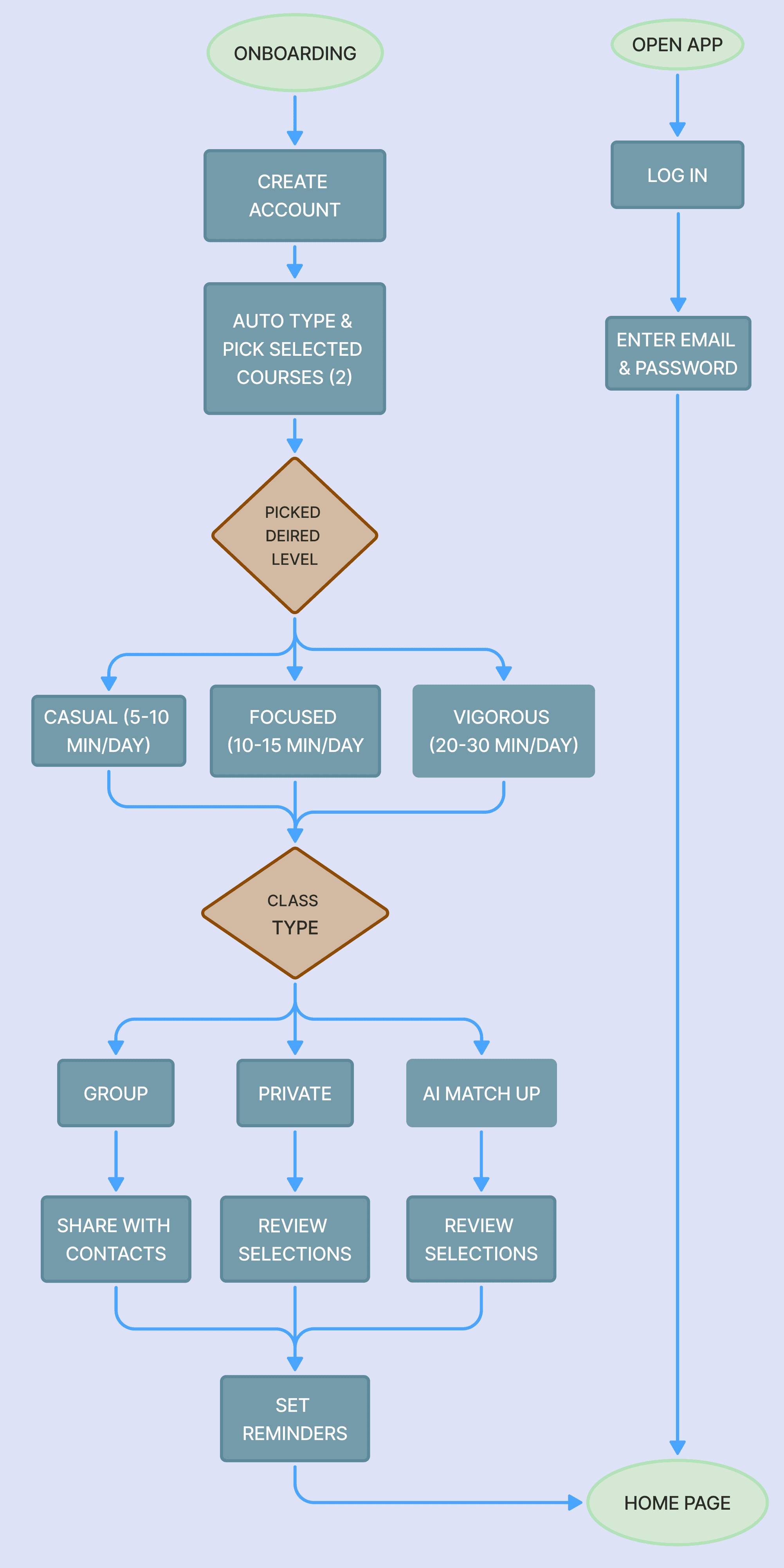
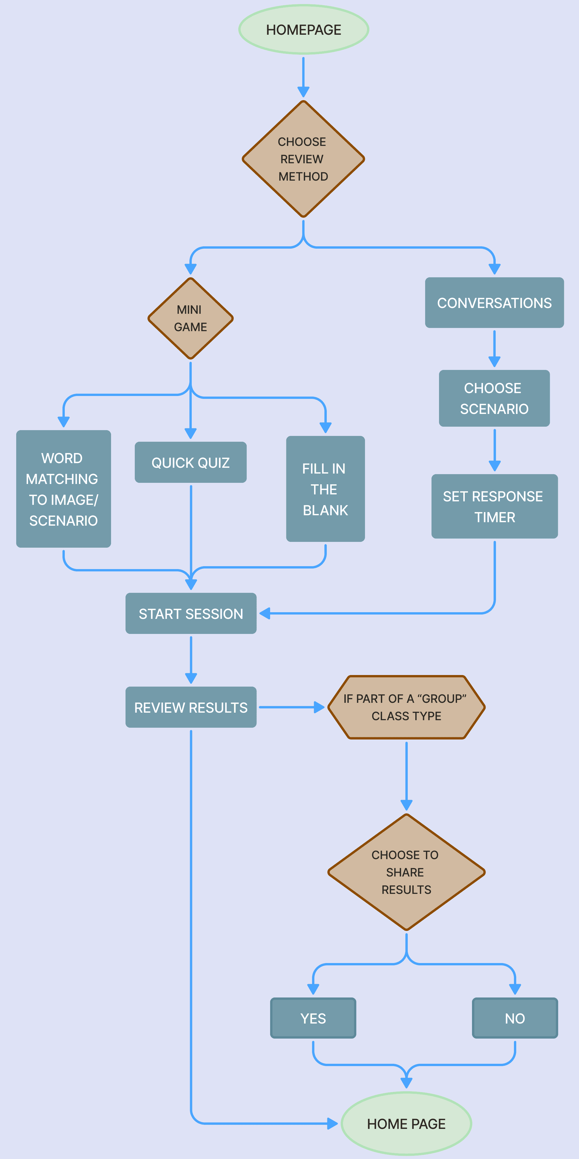
User Flows Outlining Wireframes
Before starting the process of creating wireframes and prototypes, user flows were created to help guide the process. This gave an outline for which we can make a step-by-step process of users going through our app for the first time or logging in and reviewing their lessons

Lo-Fi Wireframes & Audit
Creating first draft of wireframes helped to provide a structure for creating an account and setting up a study plan. The navigation strategy focused on knowledge retrieval. I applied Jakob Nielsen’s Usability Heuristics to audit early drafts, identifying and mitigating friction points to ensure the interface remained intuitive during rapid, mobile use.

Usability Tests & Outcomes
Testing revealed that users preferred a flattened information architecture. To address this, I reorganized the dashboard to reduce 'taps-to-task' while utilizing visual cues to guide users toward advanced features without cluttering the primary interface.


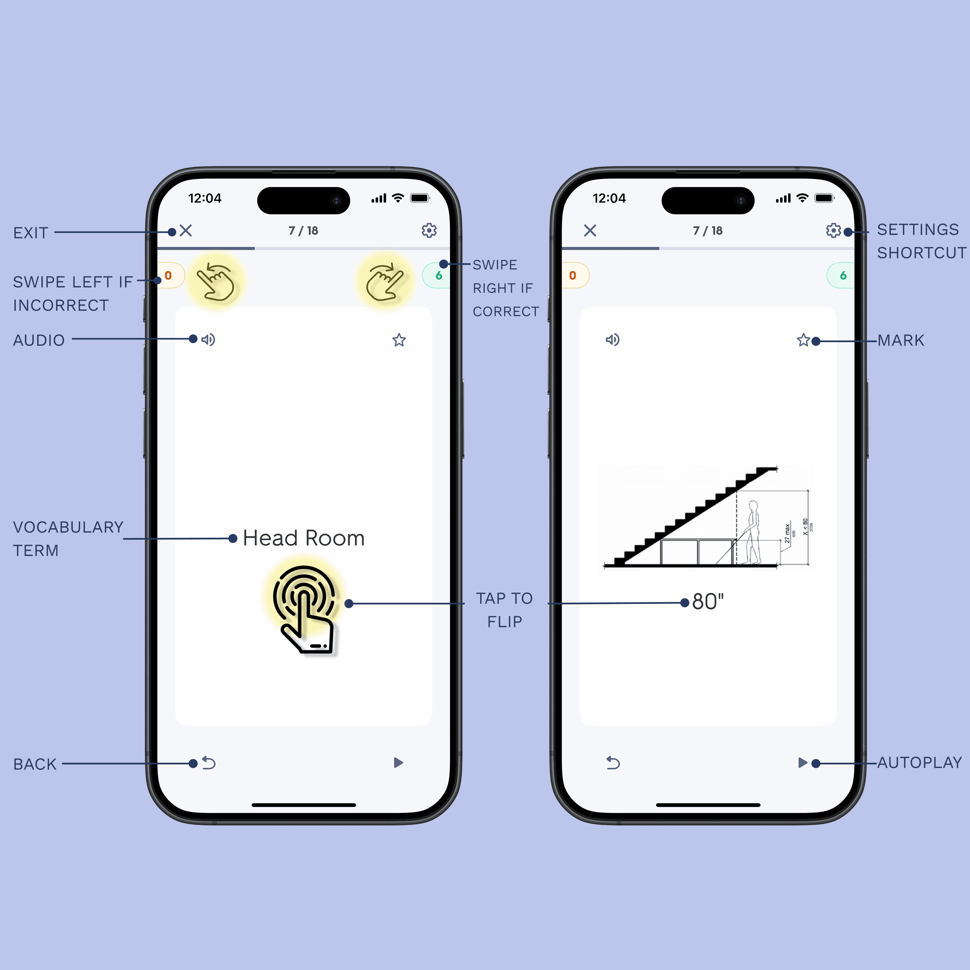
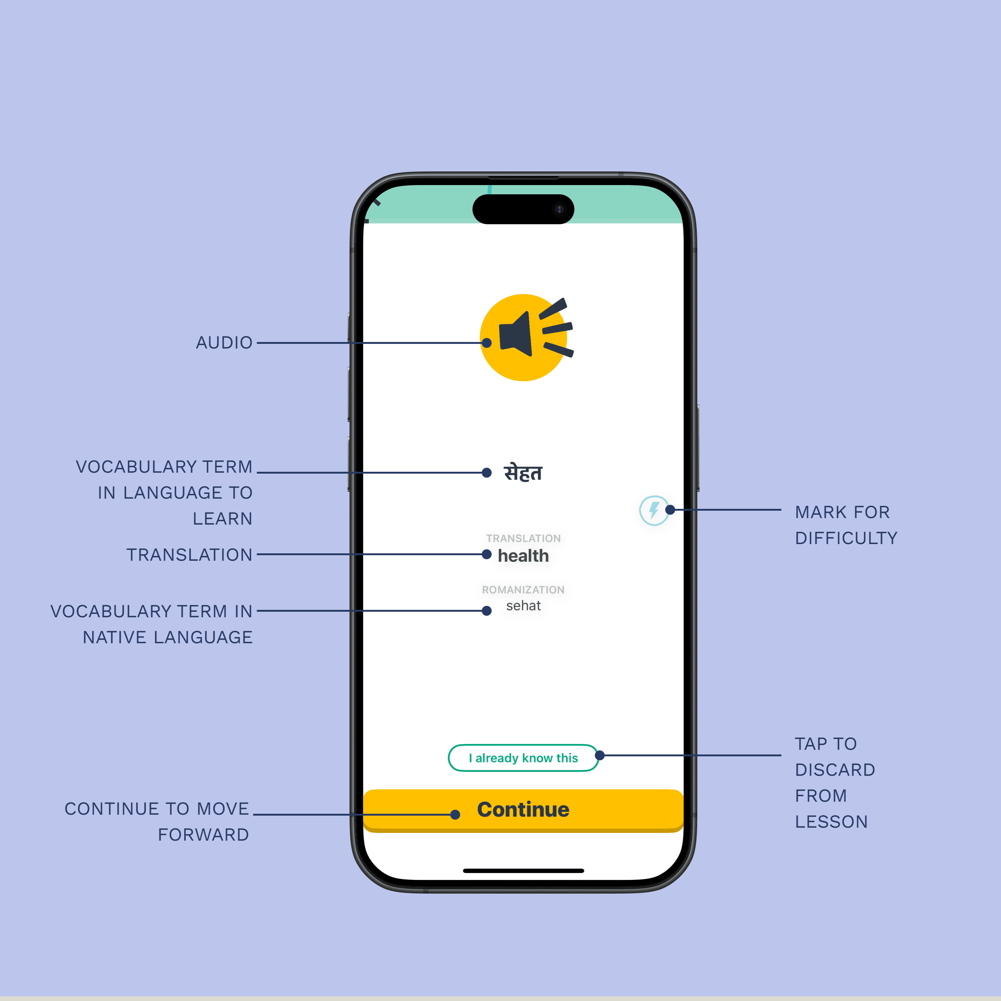
Hi-Fi Prototypes & Next Steps
After solutions were identified, layouts were reorganized, icons were developed to guide users to the categories they seemed most interested in first. This was a good start to implement with AI. Stitch and Figma Make were used to start refining prototypes as well as explore options in how users review and practice using what they learned in conversations either solo, with a tutor, or with their study group.